01 WHITE PAPER RESEARCH
There was a clear market gap between existing cosmetics brands and the growing demand for sustainable products. As consumers become more mindful of their choices, the need for clean, eco-friendly personal care items has skyrocketed. In fact, 53% of all consumers, and 57% of those aged 18-35, have switched to lesser-known brands solely because they were sustainable. Moreover, 61% of consumers are willing to pay more for sustainable products, while 52% report feeling an emotional connection to brands that align with their environmental values. Additionally, 70% of millennials actively seek out brands with a strong sustainability mission, reflecting the shift towards conscious consumption.
02 STAKEHOLDER INTERVIEWS
I collaborated closely with the founders, product manager, marketing team, and engineers to deeply understand user needs and expectations for the website. Since the platform would serve as the primary point for brand interaction, it was crucial to align it with both user experience and business objectives. To ensure a user-centric approach, we discussed key aspects such as:
- Are there any key products or categories that should be highlighted or prioritized?
- How will the digital marketing strategy, and the eCommerce platform cordinate?
- Are there any design inspirations or competitor websites you admire?
- What are the key customer segments that the platform should cater to?
- What ongoing support, maintenance, and updates will be required after launch?
Conclusion:
- Clean, asymmetrical, minimal-looking layouts
- The story of the brand needs to be communicated throughout
- Imagery needs to include diversity and a sense of calmness
- Create a sense of community where users can contribute content and read blogs shared by customers
- Target audience is between the age of 30 - 45 and have disposable income as the products are of premium pricing.
- Instagram will be the main source of marketing and customers will be asked to purchase products from the website.
- The aim is to share our products in a way that feels natural and authentic, inviting customers to connect with our story and values, rather than feeling pressured by a sales pitch.
03 USER INTERVIEWS
Five female participants, aged 25 to 40, were recruited for user interviews to gain insights into their motivations for purchasing sustainable products and the significance they place on sustainability. The focus was on understanding the products they currently use, the challenges they face, and their willingness to pay more for clean, eco-friendly options. Key interview questions included:
- How important is sustainability in your purchasing decisions for cosmetics?
- What specific ingredients or practices do you avoid when choosing cosmetics?
- How do you balance sustainability with other factors like price, performance, and convenience?
- What challenges do you face when trying to find sustainable or clean cosmetics?
- How often do you purchase cosmetics, and where do you typically shop for them?
- How do you research products before purchasing?
- Which cosmetics brands do you currently use, and why did you choose them?
04 INSIGHTS & THEMES
5 participants, 120+ data points, 20 insights and 3 main themes
Consumers prioritize transparency and authenticity in sustainability claims, with a strong preference for brands that not only provide eco-friendly products but also clearly communicate the environmental and health impact of their ingredients and practices.
Based on research insights I identified three themes: Education & Awareness, Challenges, and Motivations
05 PERSONA DEVELOPMENT
Bella represents users who are willing to learn about sustainability but need affordable, accessible options. They are constrained by limited product availability and high prices.
Hannah represents users who are often frustrated by the lack of transparency in sustainability claims. They struggle to verify whether brands genuinely engage in sustainable practices.
06 HOW I MIGHT...
create an intuitive and transparent eCommerce platform that effectively communicates sustainability practices while providing affordable, accessible clean beauty products to empower eco-conscious and budget-conscious shoppers?
07 INFORMATION ARCHITECTURE
I began the design process by performing a card sort with three participants. I gave them 12 cards, 5 category labels, and asked them to assign each card to the category they expected it to be in. They sorted the cards into the categories they felt were most appropriate, offering insights into their mental models, preferences, and suggestions for improvement.
08 IDEATION
For the ideation phase, I utilized the Crazy 8 brainstorming exercise. The Crazy 8 brainstorming session entailed 5-minute intervals of 8 sketches, with an intentional break of 20-30 minutes. I didn’t compose 8 sketches each time, but this exercise forced me to push out ideas, and I spent the breaks thinking about the ideas I wanted to elaborate on. This was a great exercise to get my ideas on paper. After doing this exercise 5 times, I compiled my sketches and grouped them according to themes.
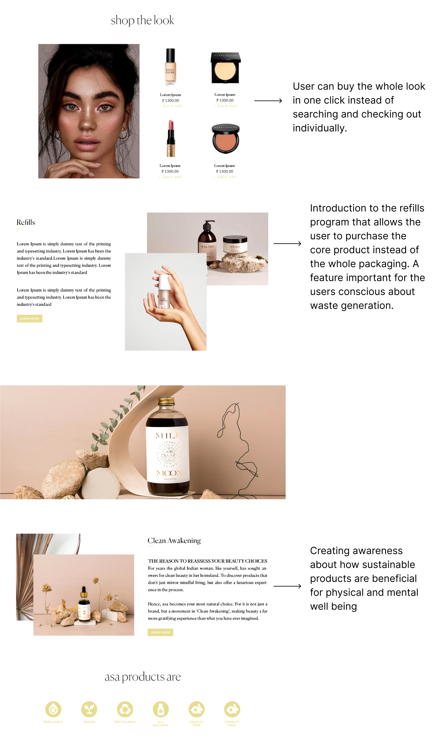
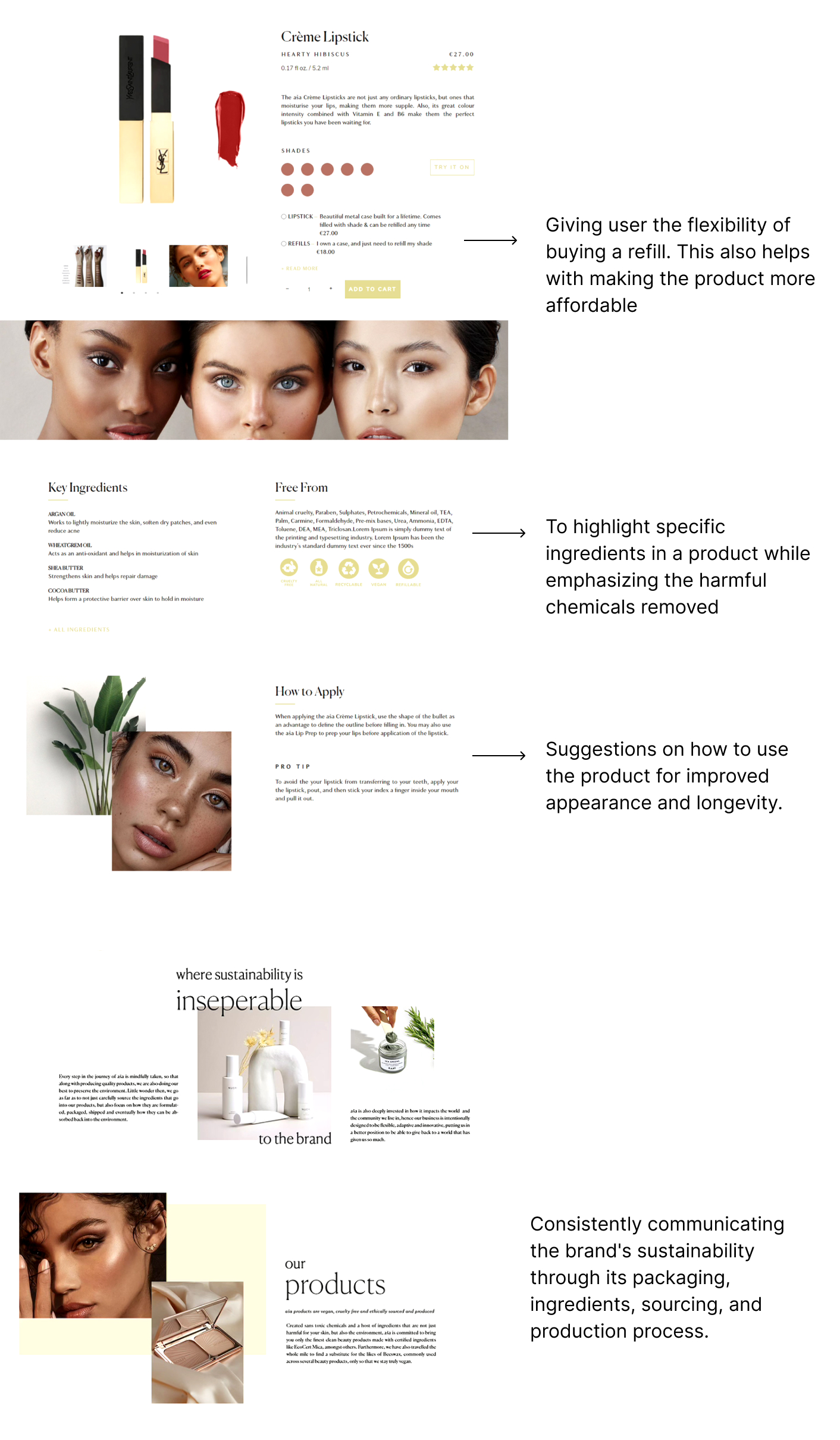
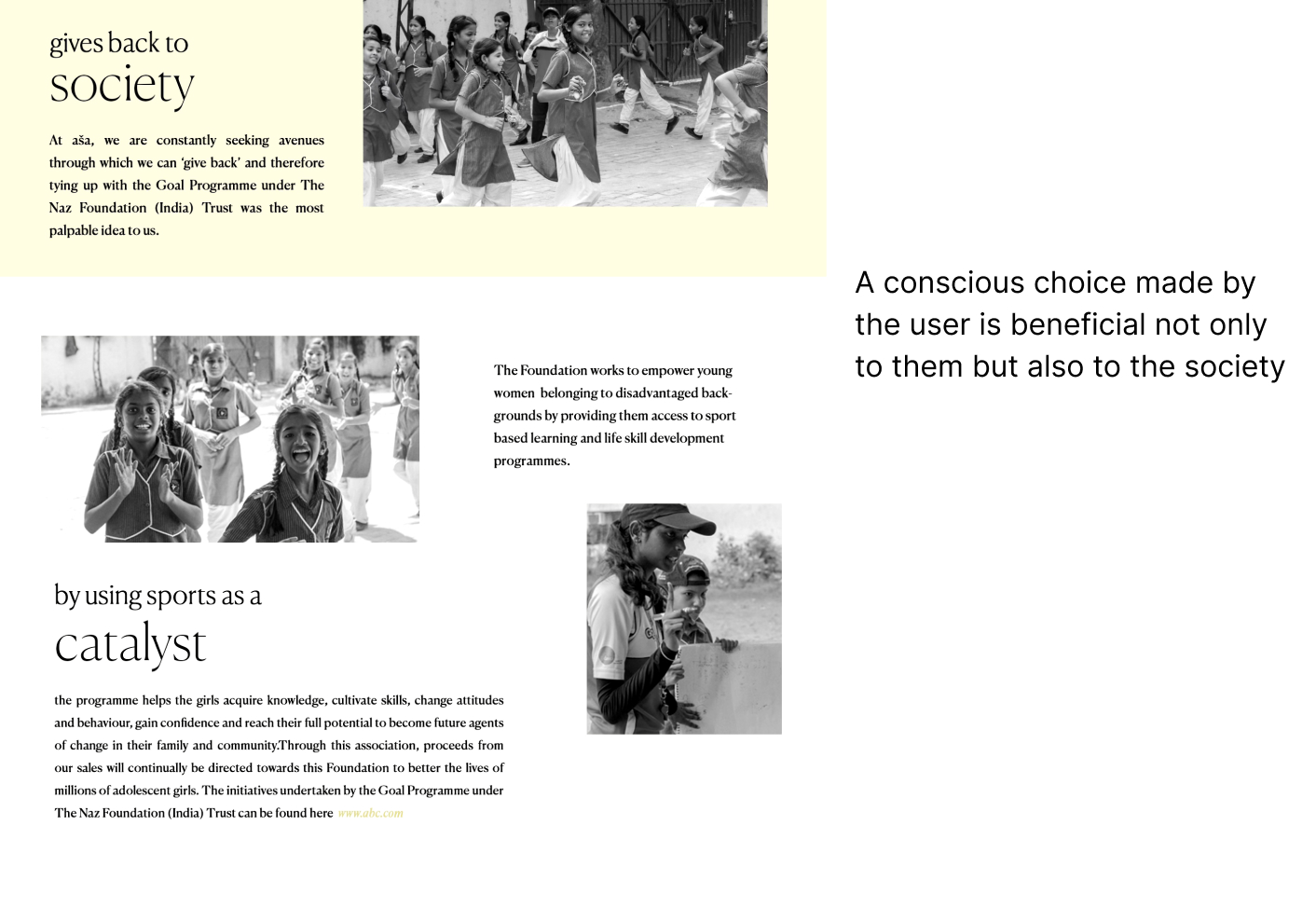
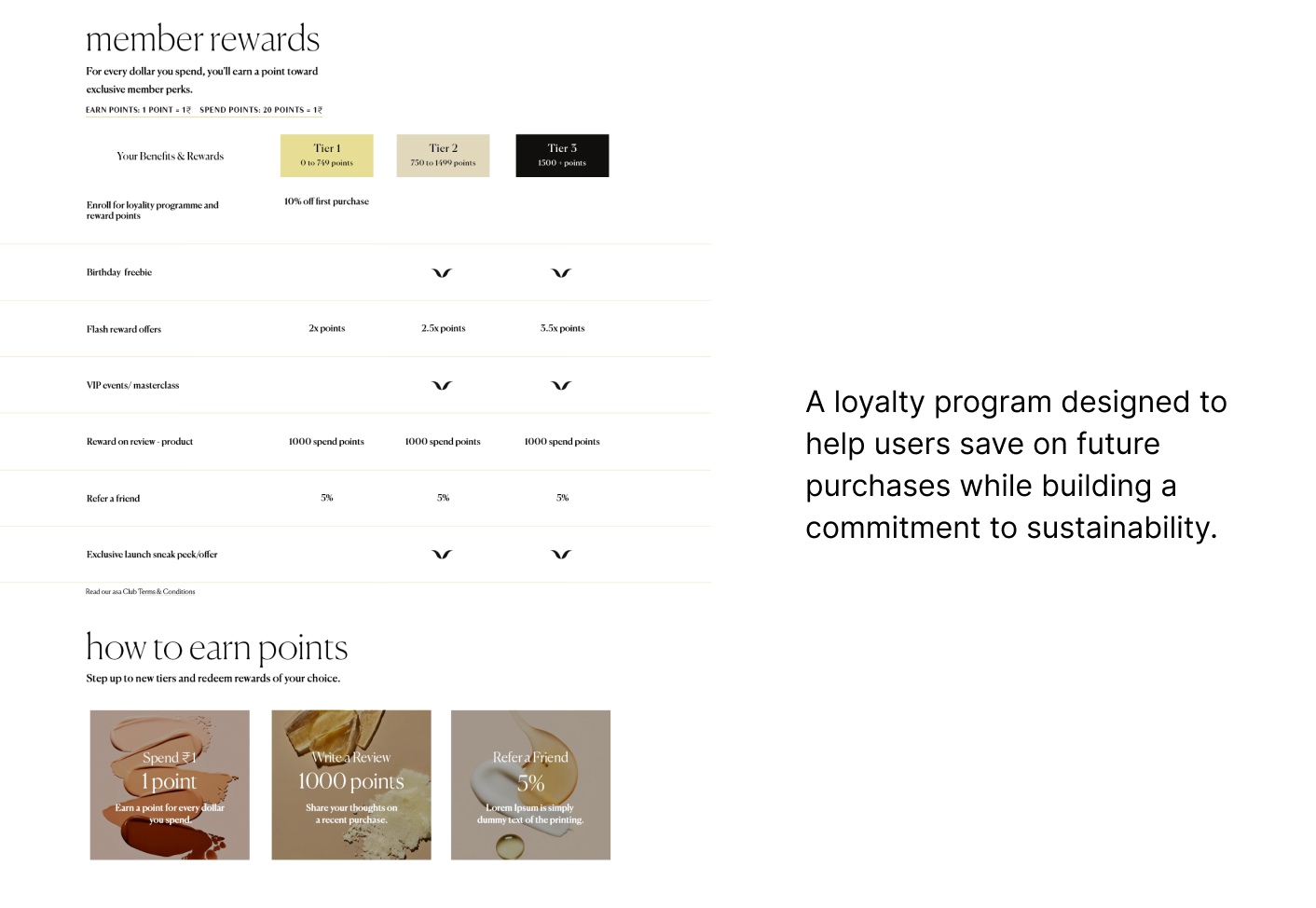
09 FINAL DESIGN + SOLUTIONS
The brand’s aesthetic is a unique blend of playful, minimal, luxurious, asymmetrical, and structured elements, reflected in both its layouts and overall design language. To ensure that this aesthetic resonated with the brand’s values, I conducted a thorough analysis of competitors who share similar design principles. Drawing inspiration from their visual strategies, I crafted a distinctive yet cohesive look. This approach not only enhanced the user experience but also created a visually appealing, distinctive, and alluring shopping journey.
10 COLLABORATION WITH ENGINEERS
Once the designs were refined, multiple rounds of testing and recommendations followed. I worked closely with engineers to ensure that the designs were not only implemented accurately but also provided an optimal user experience, ensuring the website functioned as intended and aligned perfectly with the design vision.